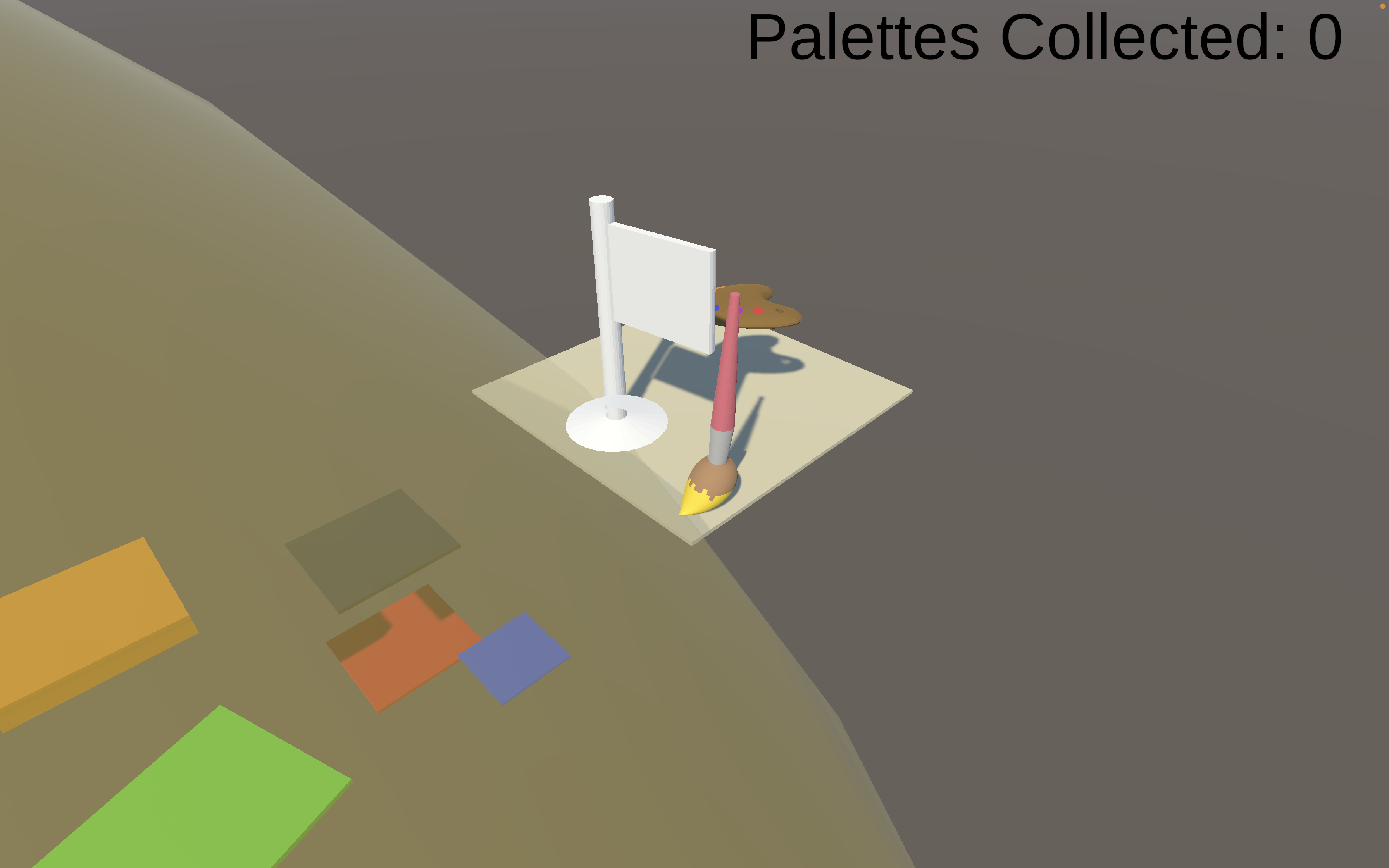
Postmortem Reflection by Nat, Jordan, and Isai
Colorized Chaos Postmortem Reflection
What did you change from the initial plan?
There were three large changes we made to the game early on in development, which were features that we had to scope out. Initially, instead of having colored objects already existing in the world whose colors could be activated, we wanted the player to be able to paint objects individually instead; if implemented, players could have more agency for traversing the levels and reaching the end by being able to paint select objects any color they wanted. The second feature we had to scope out was adding in objects (additional platforms, 3D shapes, etc) in real-time during the level, which could have led to some funny emergent gameplay. The third and final idea present in the initial plan but absent in the full game was enemies; the idea was that they could slither along the ground, changing the color of the level pieces as they moved over them, including the player. As time progressed and we came to better understand the workload the project would bring, we made the decision to reduce the scope of our game and exclude these elements.
What went right with your final project?
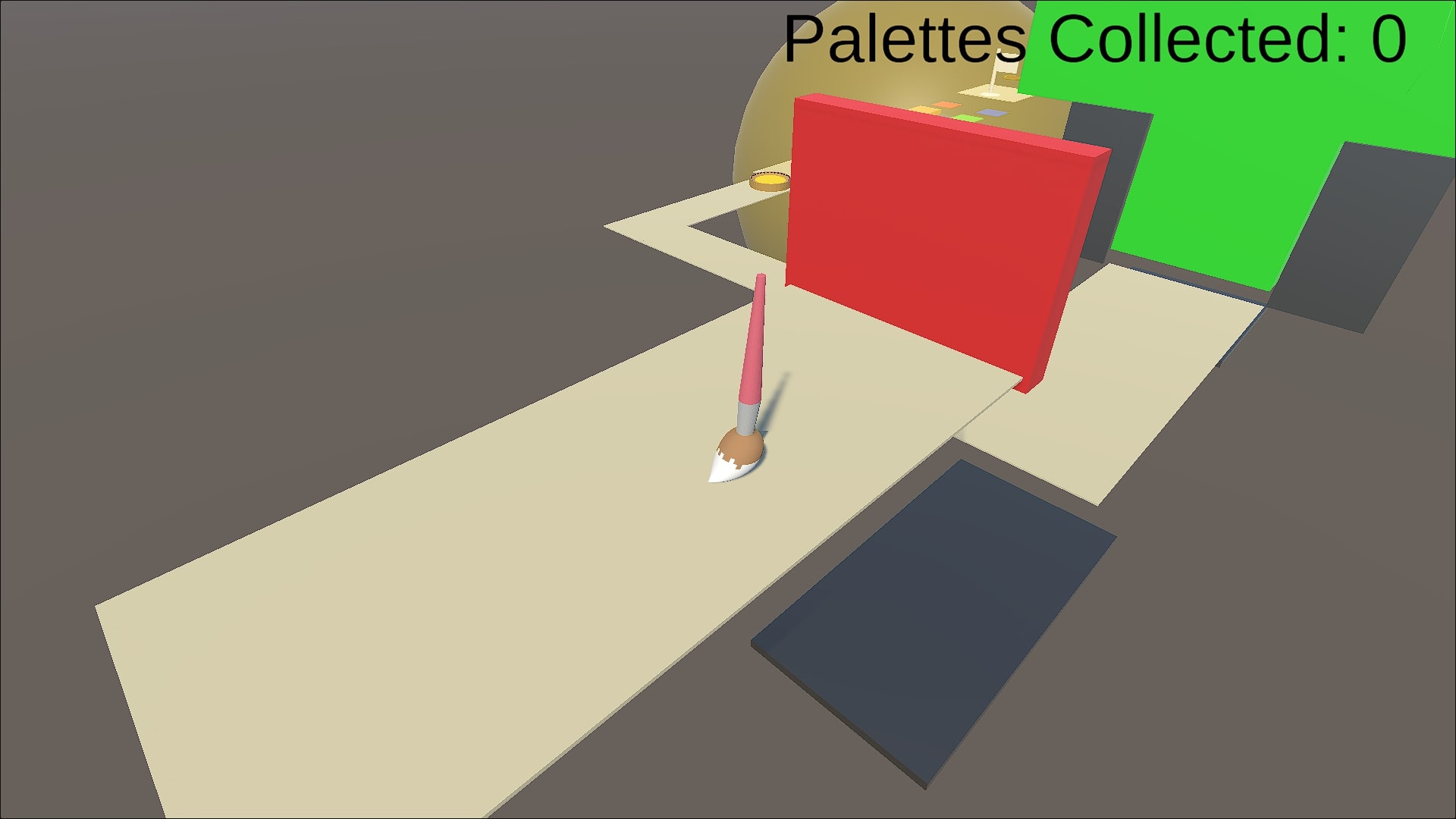
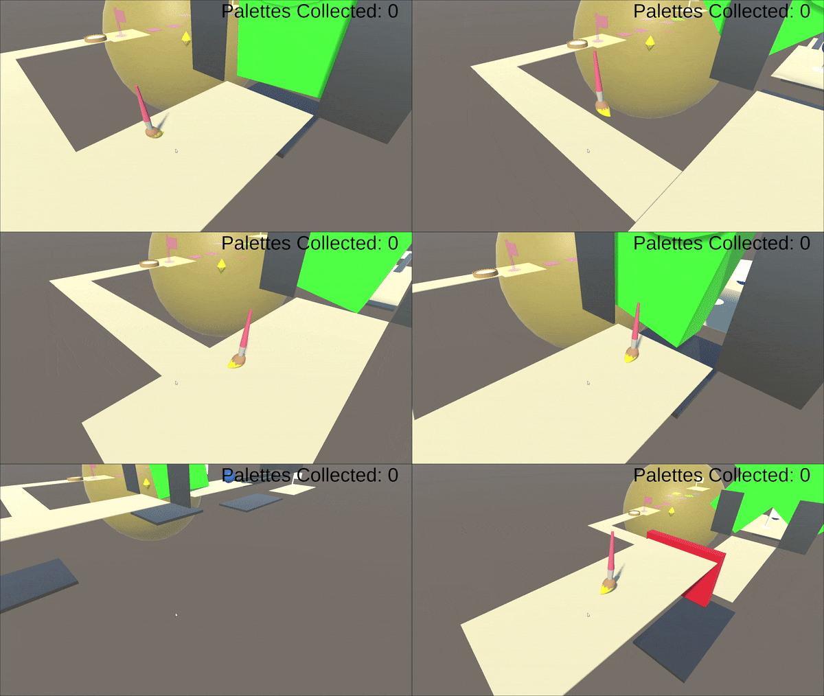
The implementation of the color abilities worked well, and the color abilities themselves were simple, but deep in interactions. By the time the implementation was complete, creating new levels was as trivial as making the ideas and placing differently named materials and prefabs into the level. The main menu and buttons were completed in a streamlined and effective way, while also being appealing through the juice we implemented. We are also quite happy with the original music and 3D models made for the game, and they all worked well together in the final product.
Jordan's thoughts:
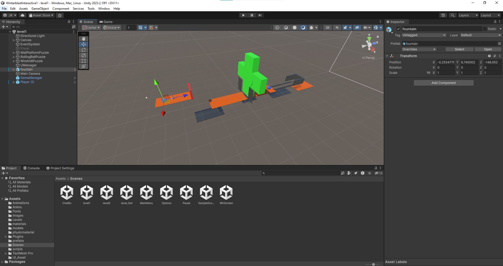
Prior to this project, I had never made any games where I was a level designer. Most of the time, my work was done in the backend, things players of my game couldn't see. Taking on the responsibilities of a level designer forced me to use parts of my brain that I really hadn't before; thinking of things within 3D space and the interconnectivity of it all was a fun and unique experience.
Nat's (Nathaniel) thoughts:
In this project, I worked as the lead programmer, and the experience was quite enlightening as to the balance of feasibility and ambition when it comes to game design. When we began the project, we made a number of different effects for the colors, but I quickly found that a number of the colors were unfeasible to implement in the limited time we had. For example, we wanted blue to teleport players between other blue objects, but the idea fell apart when I thought about how implementation would actually work. Ultimately, I had to bring these concerns up to the rest of the group, and that discussion ultimately lead to a better game. Working through those challenges as a team was an excellent experience in communication and compromise that will be very beneficial for me in the future.
Isai's thoughts:
In this project, I had a hand in level design, UI, and music. I got to take a stab at designing levels in a 3D space, which was a complex but interesting challenge. It was always fun to start with a whiteboard, picture the level, and then move to Unity to implement. I am so fortunate that our lead programmer, Nat, made testing out colors and abilities so efficient, so we could easily tinker with the size of an object, its placement, etc. Level design could focus primarily on what was fun, engaging, and challenging instead of dealing with technical hurdles along the way. While Jordan took care of the UI in nearly every scene, I was able to implement the color wheel UI in our levels, which was really fun. It was nice to make a UI element that did more than just go to the next scene, etc. Making music for this game was quite difficult since I am still really new to the music-making process, but it was cool to think of the feelings we wanted the music to evoke in our levels. It was also the first time I implemented audio and music into Unity, which was an important learning experience. While our game had its issues, I am so, so glad to have worked with this team and to have learned so much about the efficiency of code organization, good level design, functional UI elements, and background music implementation.
What went wrong with your final project?
The issues that affected our final project came from our time mismanagement; we waited too long to record the video, and as such, when unexpected bugs arose in our game we had no choice but to continue on and keep recording. Additionally, the build process failed, so we had no choice but to record the gameplay video from within the Unity editor. Most importantly, the levels were playtested individually. It was only towards the deadline that everything was linked together, and it was there that we found a majority of bugs that had not shown themselves before.
What would you do differently next time?
We should have considered the scope of the project more thoroughly and given more weight and time to polish and presentation. Our game had 7 different colors (not including the neutral white), each with 2-3 unique effects that work in tandem with each other. However, what each of these are and what they do is not communicated to the player in any way, making levels extremely confusing. Further, we should have spent more time on removing bugs from the game. We had worked mostly separately on levels up until then, and it was inevitable that bugs would arise, but we did not give ourselves enough time to fix them. This led to even less time to work on the presentation on the game, which was made even more difficult due to the amount of content that the game has, and how poorly it was communicated.
If you could add one more week of development, what would you add?
If we could add one more week of development, we would focus our attention on assembling our game and levels to be a cohesive whole and resolving any bugs that arise from it. We would have also added ways to convey information to the player, such as what each color on the wheel does (perhaps in a tutorial segment that showcases all the colors’ abilities). In addition to UI improvements, an additional week would have allowed us to add more juicy interactions as well. One more week would have allowed for more polish and, as a result, likely a better video.
